[et_pb_section admin_label=”section”][et_pb_row admin_label=”row”][et_pb_column type=”4_4″][et_pb_text admin_label=”Text” background_layout=”light” text_orientation=”left” use_border_color=”off” border_color=”#ffffff” border_style=”solid”]
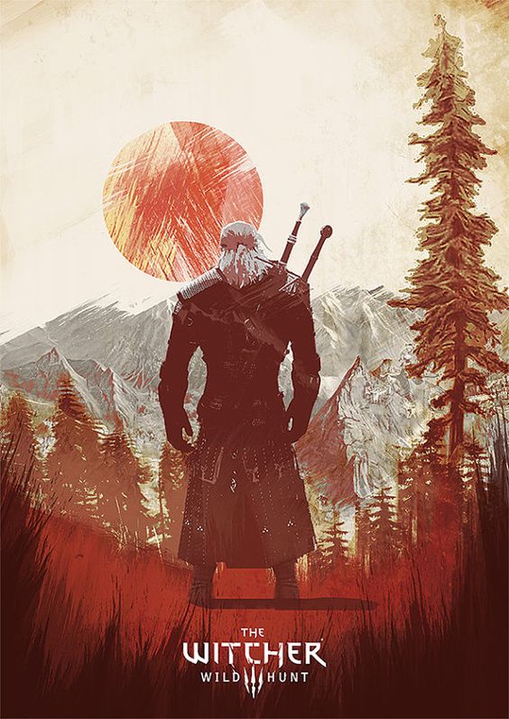
For this reverse engineering post I wanted to find a poster that plays with gradients, and sticks to one color, so close to a project that I am working on right now. So right of the bat you see that the lines are bringing you to the center of the poster.
[/et_pb_text][et_pb_image admin_label=”Image” src=”http://www.clintaverett.com/wp-content/uploads/2016/11/RE3-lines.jpg” show_in_lightbox=”on” url_new_window=”off” use_overlay=”off” animation=”off” sticky=”off” align=”left” force_fullwidth=”off” always_center_on_mobile=”on” use_border_color=”off” border_color=”#ffffff” border_style=”solid”] [/et_pb_image][et_pb_text admin_label=”Text” background_layout=”light” text_orientation=”left” use_border_color=”off” border_color=”#ffffff” border_style=”solid”]
And after that you can see that the overall theme is that color red.
[/et_pb_text][et_pb_image admin_label=”Image” src=”http://www.clintaverett.com/wp-content/uploads/2016/11/color-re3.jpg” show_in_lightbox=”off” url_new_window=”off” use_overlay=”off” animation=”off” sticky=”off” align=”left” force_fullwidth=”off” always_center_on_mobile=”on” use_border_color=”off” border_color=”#ffffff” border_style=”solid”] [/et_pb_image][et_pb_text admin_label=”Text” background_layout=”light” text_orientation=”left” use_border_color=”off” border_color=”#ffffff” border_style=”solid”]
The only different color of the poster are the mountains, which are grey. That adds a nice element of contrast to the red without going overboard. The next thing you can see are the gradients. But it is a very unique use of gradients, and very subtle use of them as well.
[/et_pb_text][et_pb_image admin_label=”Image” src=”http://www.clintaverett.com/wp-content/uploads/2016/11/RE3-grad.jpg” show_in_lightbox=”on” url_new_window=”off” use_overlay=”off” animation=”off” sticky=”off” align=”left” force_fullwidth=”off” always_center_on_mobile=”on” use_border_color=”off” border_color=”#ffffff” border_style=”solid”] [/et_pb_image][et_pb_text admin_label=”Text” background_layout=”light” text_orientation=”left” use_border_color=”off” border_color=”#ffffff” border_style=”solid”]
It is so well done, that unless you were looking for them at all you wouldn’t really see them. But the designer used them all over the poster. Over all I just like how the designer was able to take simple elements and combine them into a visually appealing poster.
[/et_pb_text][/et_pb_column][/et_pb_row][/et_pb_section]
