The Project:
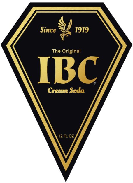
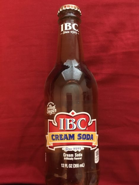
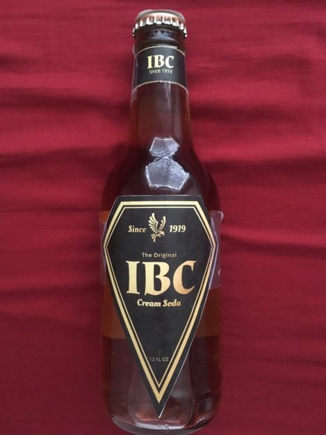
For this project, I wanted to redesign the IBC Cream Soda label. The one that they have on now it seems a little childish to me, I wanted to market this product to adults, between the ages of 23-38, who do not want to be seen drinking something unless it looks classy. But like I said the original design looked like it was being marketed towards the ages of 8-15.
Inspiration:
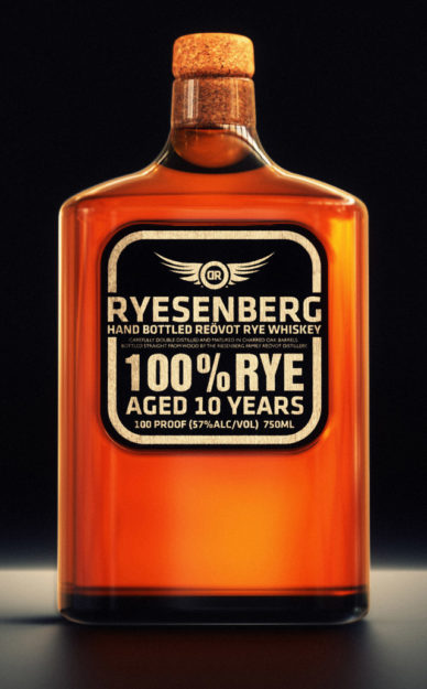
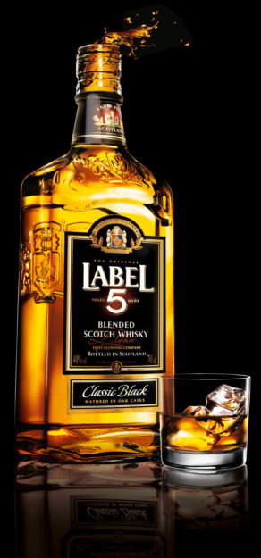
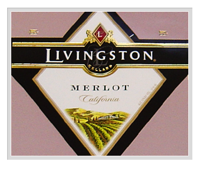
I started looking at a lot of different sodas, and yes a lot of different wines, and whiskies. Because I found those labels classier. So things like this:
And my color scheme I wanted it to be super simple much like the ones above. So black with a gold texture to give it a little bit of class.
The Re-Design:
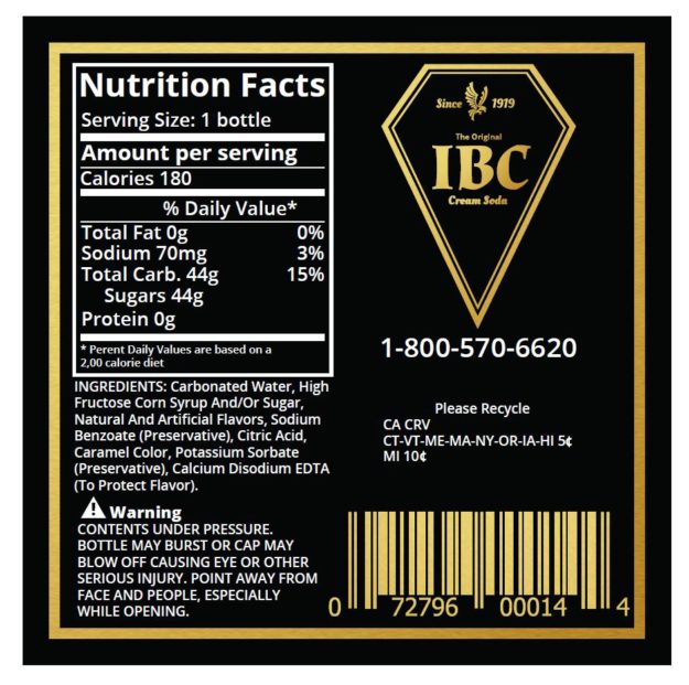
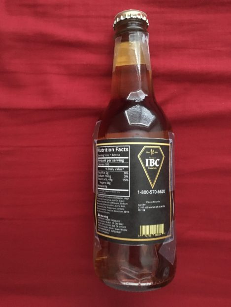
This are the flat package designs, the one on the left is the front label, then the lid, and finally the nutrition label. I got the idea for the eagle for the design, from the design I have seen before. Most of the ones I was looking at had something like a coat of arms or something to make it stand out. So I designed the eagle because it is made in America. I looked at a lot of design and them using them for reference came up with this.
Construction:
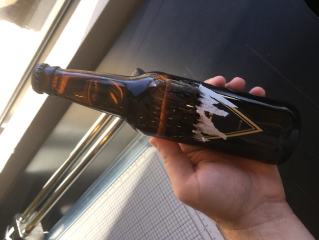
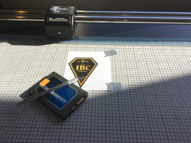
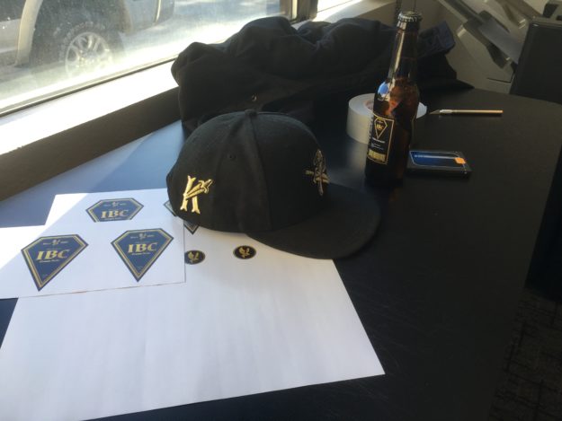
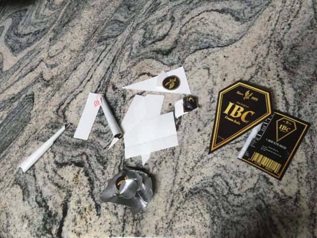
And after printing the labels for real about 6 times. Many times spreading peanut butter to get the sticky residue off, using my X-acto knife, and my ghetto ruler. I was finally able to but it on the bottle correctly.
Old and New:
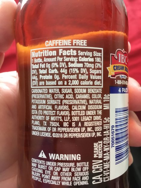
Here is the front label back and from old and new.
I believe that the new design will resonate with a more adult audience, it looks more adult, looks classier, and now you don’t have to feel awkward drinking a cream soda because it looks like an adult beverage.


