[et_pb_section admin_label=”section”][et_pb_row admin_label=”row”][et_pb_column type=”4_4″][et_pb_text admin_label=”Text” background_layout=”light” text_orientation=”left” use_border_color=”off” border_color=”#ffffff” border_style=”solid”]
I decided that I wanted to explain the rules of composition in the video game poster. Which I might add was a little hard for me. But I choice the poster because it stands out to me, and it is a fantastic game. So let’s start out with the rule of thirds.
[/et_pb_text][et_pb_image admin_label=”Image” src=”http://www.clintaverett.com/wp-content/uploads/2016/11/Screen-Shot-2016-09-26-at-11.36.48-AM.png” show_in_lightbox=”off” url_new_window=”off” use_overlay=”off” animation=”off” sticky=”off” align=”left” force_fullwidth=”off” always_center_on_mobile=”on” use_border_color=”off” border_color=”#ffffff” border_style=”solid”] [/et_pb_image][et_pb_text admin_label=”Text” background_layout=”light” text_orientation=”left” use_border_color=”off” border_color=”#ffffff” border_style=”solid”]
As you can see it is plays to the rule of thirds pretty well, thought it could still us some help. But over especially with the face it lines up well. The mask is right on the cross hairs, and so is the hand. I would have just liked it if the lower hand was on the cross hairs in the bottom right. Next I want to talk about the leading lines.
[/et_pb_text][/et_pb_column][/et_pb_row][et_pb_row admin_label=”Row”][et_pb_column type=”1_3″][et_pb_image admin_label=”Image” src=”http://www.clintaverett.com/wp-content/uploads/2016/11/Screen-Shot-2016-09-26-at-11.42.09-AM.png” show_in_lightbox=”off” url_new_window=”off” use_overlay=”off” animation=”off” sticky=”off” align=”left” force_fullwidth=”off” always_center_on_mobile=”on” use_border_color=”off” border_color=”#ffffff” border_style=”solid”] [/et_pb_image][/et_pb_column][et_pb_column type=”1_3″][et_pb_image admin_label=”Image” src=”http://www.clintaverett.com/wp-content/uploads/2016/11/Screen-Shot-2016-09-26-at-11.44.57-AM.png” show_in_lightbox=”off” url_new_window=”off” use_overlay=”off” animation=”off” sticky=”off” align=”left” force_fullwidth=”off” always_center_on_mobile=”on” use_border_color=”off” border_color=”#ffffff” border_style=”solid”] [/et_pb_image][/et_pb_column][et_pb_column type=”1_3″][et_pb_image admin_label=”Image” src=”http://www.clintaverett.com/wp-content/uploads/2016/11/Screen-Shot-2016-09-26-at-11.46.44-AM.png” show_in_lightbox=”off” url_new_window=”off” use_overlay=”off” animation=”off” sticky=”off” align=”left” force_fullwidth=”off” always_center_on_mobile=”on” use_border_color=”off” border_color=”#ffffff” border_style=”solid”] [/et_pb_image][/et_pb_column][/et_pb_row][et_pb_row admin_label=”Row”][et_pb_column type=”4_4″][et_pb_text admin_label=”Text” background_layout=”light” text_orientation=”left” use_border_color=”off” border_color=”#ffffff” border_style=”solid”]
So in the first one we see right of the bat that his eyes are looking right at the Dishonored name, the rain that is flowing down in the second one is leading us to his face, for an overall effect of what is happing in the third one where we follow the rain to his face and then to the name. So the lines are all leading to the same thing, which is the Dishonored name. Which is the most important part of this poster, as this is the name of the game.
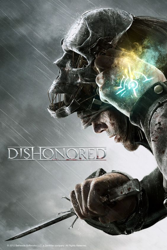
Now with the contrast we see with the overall theme is pretty grey
[/et_pb_text][et_pb_image admin_label=”Image” src=”http://www.clintaverett.com/wp-content/uploads/2016/11/Dishonored-poster.jpg” show_in_lightbox=”off” url_new_window=”off” use_overlay=”off” animation=”off” sticky=”off” align=”left” force_fullwidth=”off” always_center_on_mobile=”on” use_border_color=”off” border_color=”#ffffff” border_style=”solid”] [/et_pb_image][et_pb_text admin_label=”Text” background_layout=”light” text_orientation=”left” use_border_color=”off” border_color=”#ffffff” border_style=”solid”]
But with the little bit of color right here it really just makes this poster seem to have a little life. Which is what the game is like as well.
[/et_pb_text][et_pb_image admin_label=”Image” src=”http://www.clintaverett.com/wp-content/uploads/2016/11/Screen-Shot-2016-09-26-at-11.58.43-AM.png” show_in_lightbox=”on” url_new_window=”off” use_overlay=”off” animation=”off” sticky=”off” align=”left” force_fullwidth=”off” always_center_on_mobile=”on” use_border_color=”off” border_color=”#ffffff” border_style=”solid”] [/et_pb_image][et_pb_text admin_label=”Text” background_layout=”light” text_orientation=”left” use_border_color=”off” border_color=”#ffffff” border_style=”solid”]
Over all I think this poster uses the rules of composition pretty well, for an overall sense of being pleasing to the eyes.
[/et_pb_text][/et_pb_column][/et_pb_row][/et_pb_section]