THE PROJECT:
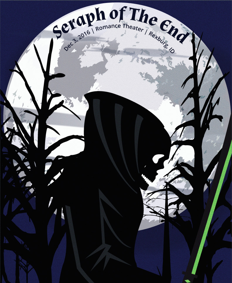
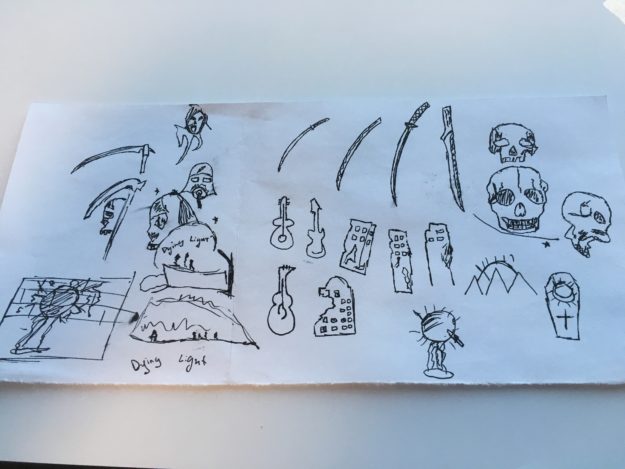
For this project, I wanted to try and design a gig poster. But I didn’t want to create anything for an existing band. I decided that I wanted to design something for a name called Seraph of the End. This is the name of an anime that I liked. But in the design, there is really nothing relating to it except the green sword edge. I felt the name had more metal feel to it. I what to do something with a grim reaper and skulls for it. That is just the image I feel that metal has.
SKETCHING:
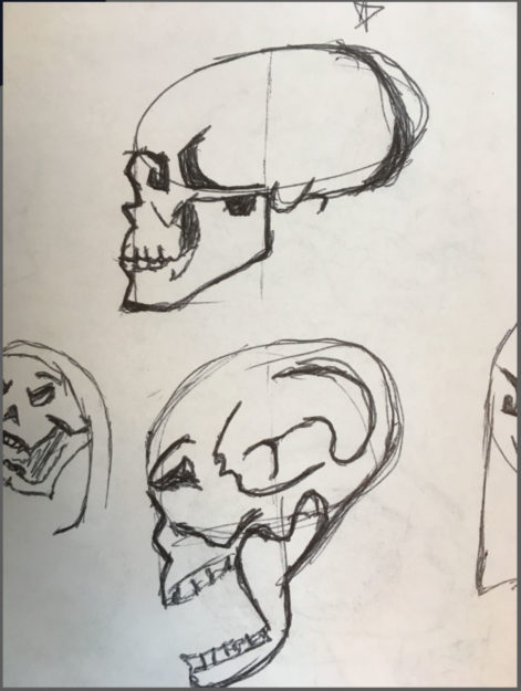
I spent a lot of time on sketches, not so much with the feel of the poster but with the skulls. I hated the skulls that I originally drew. They looked bad, like really bad. So after talking to a few people, they gave me the idea of watching people online drawing skulls. So that is what I did, I spent around 6 hours trying to replicate what people were drawing online. Finally, I felt like I had a couple of good profile views of skulls:
THE DRAFT:
I decided I wanted to play with a grim reaper-type person walking through a street at night. So I went through and got a lot of inspiration on how to try and capture the idea I had in my mind. After looking at all this inspiration I decided to move forward with a draft. And came up with this:
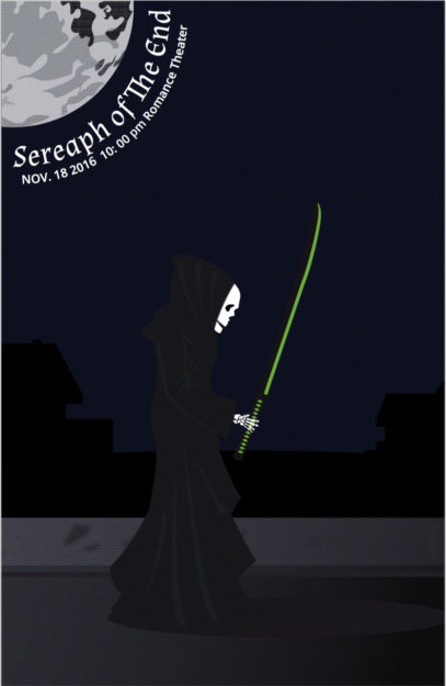
I sat at a computer looking at this for 2 hours, I knew something was off. It just was not very visual appealing. But I could not figure out what was, what was missing. So I took it in to some people, and the biggest thing is that my composition was just plain boring. Which made so much since, with that in mind I starting playing with him walking through woods, and the moon silhouetting him.
THE FINAL:
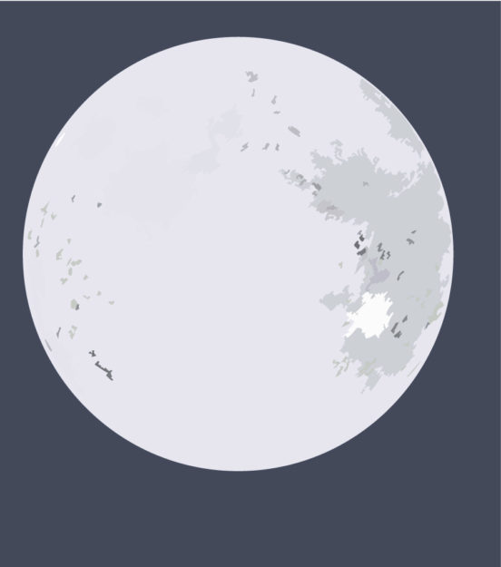
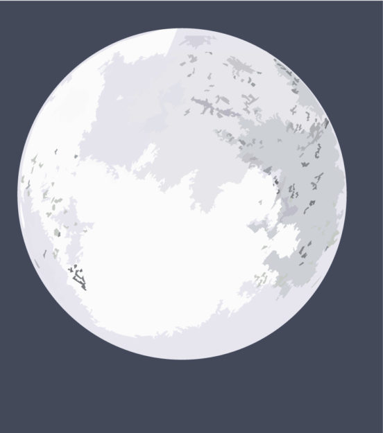
I looked at a lot of different vector moons and created my own. I started out with the basic circle and build on it from there. Playing with different shapes of squares, I wanted to make it somewhat simple. and just change the size and color of the shapes.
Finally I had the whole moon, I decide to give it a shadow and some clouds to make it look like it was in the night sky and then I had a moon that i like.
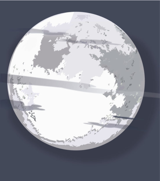
I really enjoyed how the final turned out. After that I but it in to the decide and playing with some warping effects to make it look like the trees nearest to the grim reaper looked like they where bending away from him. This is the final poster:

I think it turned out really well, I believe I finished what I start out wanted to do. This looks like it could be a metal bands gig poster. I like the composition a lot more, it feels more personal then the draft and captures the feel of the music I set out to get.
